YOUR FACE IS YOUR
Ticket®
ID
KEYCARD
PAYMENT
CREDENTIAL
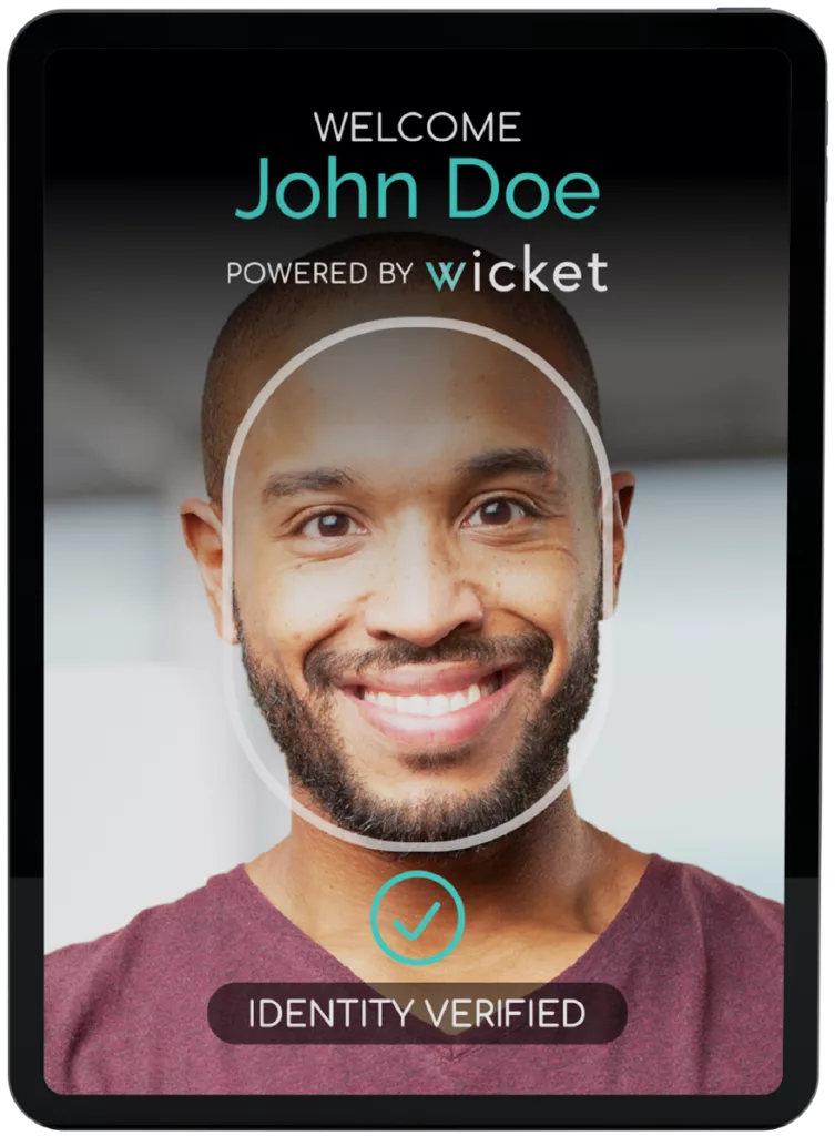
The Facial Authentication Platform
Enabling sensational event experiences for fans, guests, and employees with facial authentication touchpoints that delight users and strengthen security.
"The Wicket solutions for fan and employee ingress have been easy to implement and a surprisingly small lift for staff training. They have immediately shortened ticketing lines, improved the fan experience, and are embraced by employees, players, and coaches."
Troy Brown
VP of Stadium Ops, Cleveland Browns
"Wicket is a primary example of the commitment from our owner Steve Cohen to significantly invest in the most cutting-edge and advanced technology... We’re proud to partner with Wicket following a very rigorous pilot that showed them to be far ahead of the competition."
Mark Brubaker
CTO, New York Mets
FRICTIONLESS TOUCHPOINTS
Lightweight Facial Authentication
Cutting-edge, proprietary technology built to eliminate friction while keeping people secure and accounted for.
Facial Ticketing
Fans can link their tickets to their face, enabling expedited entry to stadiums and venues
Facial Payments
Guests can link their preferred
payment method to their face, simplifying payments
Facial Credentialing
Increase accountability and ensure only those with creds can enter sensitive areas
Facial Access Control
Eliminate the risk of lost and misused credentials by replacing IDs with selfies